Showing posts with label drawing. Show all posts

Thursday, June 8, 2017

Willy...or Wilma?


Today I've got a wonky woman Wonka for ya!


She is, of course, based off of classic Gene Wilder Wonka, and not the monstrosity that was the Johnny Depp version. 

I actually like Johnny Depp most of the time, but his version of Wonka was like a personal affront to society...I demand a written apology.  Shame on you, Johnny...shame...

My favorite part of my drawing is the hair...curly hair is...evasive(?) for me, and I think this drawing gives the essence of curly...and that's really all I can hope for at this point.  So...yay!

I liked the process of using an already known character and making it my own way...I know a lot of people are doing this with various cartoons (notably the 10 million different versions of Disney princesses), and I think its a fun exercise.

I use reference photos a lot when I draw, but usually not "known" people or characters.  I think using something someone else has done and saying "how would I have done this thing?" is an interesting way to stretch your creative muscles without the pressure of having to come up with the entire concept on your own...and I think its ok as long as you acknowledge that you didn't create the concept, only the interpretation...

Who knows, maybe I'll try my hand at some more character 'stealing' in the future...and if you try your hand, I'd love to see it, so leave me a comment and tell me where to go!  (To see your art, not the other option!)


Monday, May 29, 2017

Frida The Dog, Inspired by Frida the Person


Frida Frida

I was inspired to do a picture of Frida, the most adorable dog I know, inspired lightly by Frida Kahlo:


Flowery Fridas galore...

  You know what's hard to draw?  Frida.  The dog, not the person...  The person I might have had better luck with...lots of human face practice...not enough puppy face practice.

So I thought I might check out some tutorials for drawing dogs which resulted in this:


I used THIS tutorial for my drawing.

I think it turned out better, still cartoony but more correct than my Frida drawing.

I like to see what I can come up with on my own sometimes and then go for a tutorial.  I think it helps me assess my progress. 

My Frida drawing is better than it would have been when I started, better than just a year ago even.  But there's still a lot of room for improvement of course and that's exciting...I have so much further to go!

Art is one of those things where the journey is at least as important as the destination...
It's learning skills, but also style and personal preference.

I enjoy learning and growing...

I enjoy the journey that art takes me on...to the point where I am often glad that I have so much further to go...

When the journey is this much fun, who worries about the destination?

Sunday, July 28, 2013

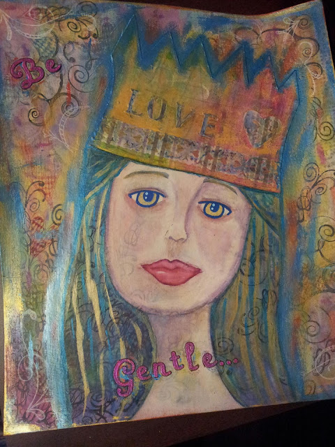
Layer on layer...

I'm a prompt!  I'm a prompt!

OK, so here's the story: In one of the groups I'm in on Facebook (M3 shout out!!!), we were having a discussion about layers.  They are awesome!  Yes...BUT they are not the easiest thing to learn!  So, one of the ladies was asking about how people in the group do layers.  And as it turned out, we all had layer issues!  I'm so happy, because I thought I was the only one!  Layering has been on my ever growing list of things I need to work on for a LONG time.  But I have been practicing...

I am DEFINITELY NOT an expert (at anything...besides maybe practicing...), but I mentioned that one thing that is helping me is to start out with things I don't really like.  I mean, you don't want to cover up beautiful gorgeousness, right?  Because then you could mess up your totally awesome whatever-it-is and be really sad!  However, if you start out with something you're not really a fan of, and you mess it up, it's not really a loss, because you didn't like it (and, let's be honest, if you don't like it, you'd never use it anyway). So, to my shock and glee, they made that into a prompt, to work on layers by starting out with something you don't like.  (I actually can't leave my craft room because my head won't fit through the door!)

What I thought I would do is take some pictures to show how I arrived at the end result...so here you go: 

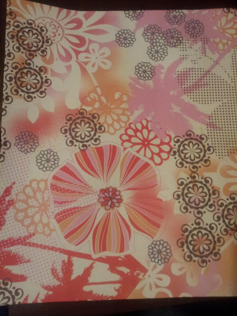
This is a piece of scrapbook paper from one of the first paper pads I ever bought.  The rest of the paper from this pad is pretty awesome, but this page has always made me gag.  I don't know why, but I REALLY dislike it.
For the first step I glued this (HIDEOUS) paper to a piece of thin cardboard (think cereal box weight). 
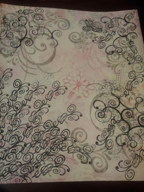
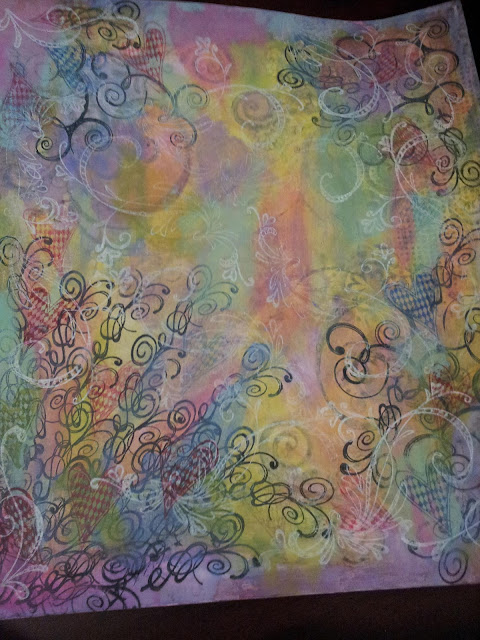
The next step was to apply a thin coat of gesso to try to tone down the brightness of the paper (did I mention how ugly the paper was to me...oh lawd, so ugly!)  After the gesso was dry, I used a large scroll stamp I had and some Dove Gray Stazon ink for the next layer.  Then, I used Jet Black Stazon and a few different scroll stamps over that.
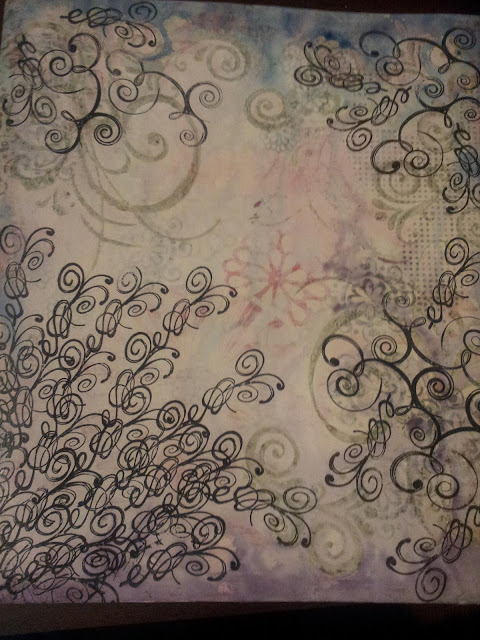
In this step, I used several different colors of Distress Stains to add some color to the gesso.  For the record, Distress Stains are REALLY awesome, and one day, I will own all the colors.  At this point, I decided I was going to do a girl (because what do I make besides girls, really?)...
So, since I decided I was going to do a girl (something I do A LOT), I thought I would change her up a little bit and try some things I don't usually do...and that's where this scrap piece of paper came in...
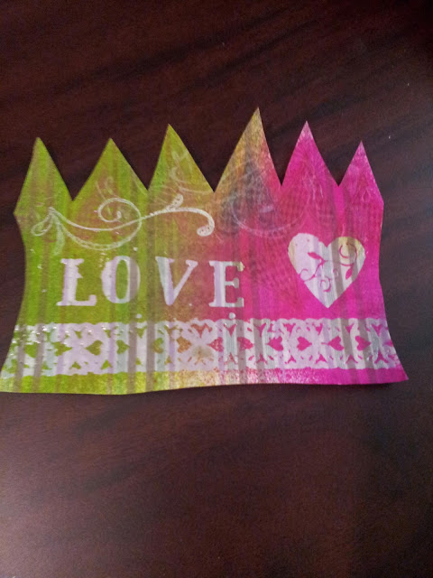
First, I embossed some stamps onto the page...well actually I cut out the shape first...but then I embossed with clear UTEE.  Then, I used some Dylusions spray inks to color in the piece.  Because of the embossing powder, the stamped images resisted the color, and so the images really stand out.  Then I added some more stamps (there's a heart one that blends into the background and then the white scroll thing).  (This is the point where I took the above picture.)  But, this looked too bright for what I had in mind, so I toned it down with some of the White Linen Dylusions.
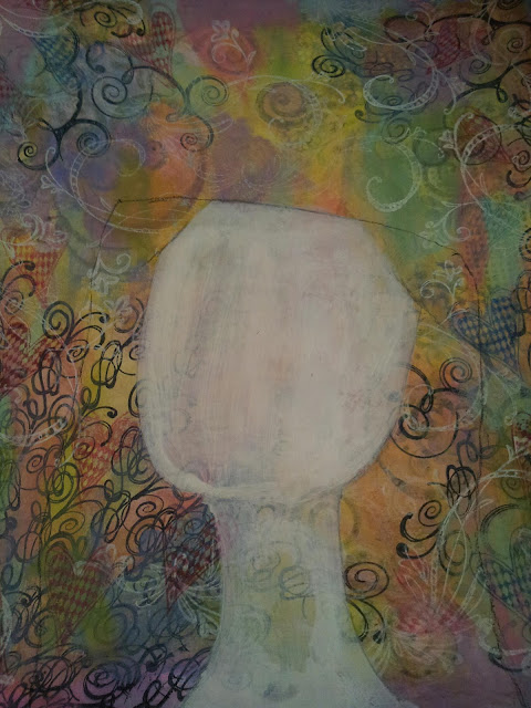
While waiting for that to dry, I set about adding paint to the background, followed by the heart stamp, and then followed by the  white stamp as well.  I kind of wanted to stop here, but seeing as how this was about layers and all for practicing, I went ahead with my plan to put a girl on the page.
I made a quick sketch of a girl face outline, took a little bit of gesso and painted her in.  I only put gesso on the actual face/neck part, because I was hoping to preserve some of the background (which makes me super happy!)...
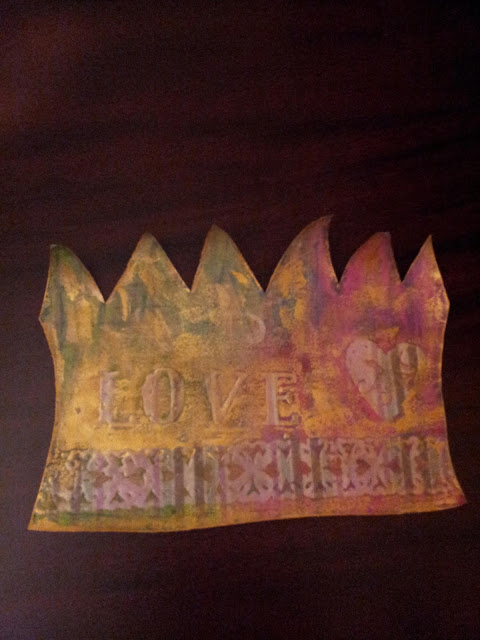
While waiting for the gesso to dry, I kept looking at this piece of scrap and decided that, even after I added the white Dylusions, I STILL didn't like how it looked in relation to everything else, so I went over it with some Inka Gold Metallic Rub in Gold.  That stuff is pretty darn awesome by the way...  I ended up liking this part much better after adding the Inka Gold.  This is the point where I got REALLY into it, and forgot to take anymore pictures until I was done...but you didn't actually miss that much craziness...or at least none that you really need pictures of for explanation...
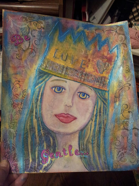
After the gesso was dry, I lightly drew in some features in charcoal.  I used some Letraset Aquamarkers to colorize.  Those things are so amazing it HURTS!!!  I will TOTALLY be having all the colors of the Aquamarkers...I know I said that about the distress stains, and one day I will...but the Aquamarkers...I will be owning all of those REALLY soon!  Basically, Aquamarkers are watercolors in marker form, but they are so amazing that I think they are actually made up of fairy dust and love from puppies.  I LOVE THEM!!!  ...ok, I'm good now.  I digress.  After I finished the face (and the Aquamarker celebrating...it was the first time I used them, I just got them yesterday), the hair looked a little flat and so I took some of the Inka Gold in Gold and added some hair lines.  I also added some Aquamarkers to the embossed areas of the crown because they were sticking out like a sore thumb...the Aquamarkers tamed them a little.  Then I added some Inka Gold in Gold around the edges and in random places on the page.  But I wasn't happy with that, the gold was too overpowering by itself, so I added some Inka Gold in Steel Blue as well.  Then I thought I'd really like to have a sentiment.  "Be Gentle" popped into my brain.  I was having trouble deciding which set of letter stickers to use for this: a set of shimmery black ones or a set of light rose color ones.  I chose the light rose ones...I chose poorly.  They REALLY blended into the background, and NOT in a good way.  So I went over them with some Inka Gold in a couple different colors...and I still wasn't happy with them.  Then I thought 'what about using the Silks acrylic glaze?'...because is there anything a little Silks can't do?  I used the Jasmine color and that was definitely the right answer.  I love those things (and yes, one day, I will have all the colors of Silks as well...)
Here's another finished photo, just to show the shiny of it.  I am pretty impressed with the end result...  While I was looking at this, I realized that I am kind of like Alice from Alice in Wonderland.  'I give myself very good advise, but I very seldom follow it'.  Starting out with something you don't like is pretty good advise...but I get lazy and don't practice it as often as I should.  Then I look at this and realize that I need to do this kind of thing more...I love how it turned out!  I really like that you can see pieces from every layer.  There's the hideous scrapbook paper, which you can see on the left side (there are little dots that come through).  There's the stamps in Dove Gray and Jet Black.  The paint, the white stamps, the crown with the embossing.  The Inka Gold in Gold and Steel Blue, and the letter stickers colored in with Silks.  I love that you can see some of the stamps coming through on her face and in her hair! 

All in all, I am really happy with the way this turned out!  It's significantly better than that (UGLY) scrapbook paper I started out with in the beginning.  And since I started out with something I didn't like, I wasn't worried about messing it up.  This gave me some extra freedom to experiment and not worry about the end result too much.  And I think that made the end result much better.  I really feel like I am a successful prompt!  I can't wait to see what the other ladies have come up with!

Wednesday, July 24, 2013

In the works...

Despite the continuation of ridiculous overtime at work, I've been staying creative in small bursts.

I mentioned in the last post that I had a plan regarding my awesome typewriter, and I've started working on making that plan happen.  The typewriter plan just happens to coincide with my goal of less pessimism that I also mentioned in the last post.  It also helps me with my efforts to do something artistic as often as I can.  

So, here's the beginning of what I hope will be a series which I think I will call Happy Thoughts.  


"Something wonderful is about to happen."
"I'm not wearing any pants."
 (This one may seem a little weird...but what's more comfortable than being pants-less?  Seriously...)
"Creativity takes courage. (-Matisse)"
"All the answers to the mysteries of the universe are held within your heart."

As you can see, my Happy Thoughts are all simple and small (post card-ish size).  They can be done pretty quickly, they use my typewriter (in all it's vintage glory) and they encase my efforts at positive thinking. Originally I had intended for them all to have white backgrounds, but I messed up the first attempt at the card with the green guy on it and so I painted over it and started again.  I didn't want to waste the watercolor paper!  I am cheap thrifty!  So, if you see any colored backgrounds in the future...you'll probably know what happened...  I am so excited about the Happy Thoughts!  

I've also been working on a little crochet.  Crochet was the first creative thing I really got into, and I still enjoy doing it...when I get the notion.  It's something that I can do pretty quickly (and still have decent results), so it fits into the plan of doing something creative everyday. 

I've been working on this for a while now.  I put it down for a long time and I just picked it back up again the other day after work.  I have a hard time with big projects (they just get boring to me after a while...I am much more a hat/scarf/toy crocheter), but I was asked to make this by a good friend, so I started.  I may even finish it...eventually...  

Since this blanket is getting ever larger as I continue to add to it, I was thinking about doing something intermission-ish so that I could have a finished something each time I picked up my hook: 

Granny Triangle using Lucy at Attic 24's pattern (which you can find HERE)
 
Since making this lone triangle, I realized it might not be the best idea to start making these triangles in the same colors as the blanket because then I'd almost assuredly run out of the colors to finish the blanket and I'd have to buy more yarn to finish the blanket.  Which doesn't seem like it should be a problem, until you consider the fact that I've got about three or four big Rubbermaid totes full of other yarn...  So (at least for today...my mind is subject to sporadic changes) this shall remain the lone triangle in these colors until the blanket is done.

I'm off now, to spend more time with my Happy Thoughts.  If you would like to share your Happy Thoughts, please do so!  I would like to hear them! <3

Sunday, June 30, 2013

Inner Excavations Week 1

No ICADS this time...I got myself all in a tizzy about messing up the prompt order (I don't know why it's such a big deal to me, but it REALLY is! *angry eyes* ) and haven't done any to the point of finishing and sharing them since.

Actually, I am thinking I am going to wimp out of ICAD...or not wimp out...but...um....back off?  I started doing the ICAD cards because I wanted to do something creative every day, and I liked the idea of something simple and small and tossable if it was too hideous.  And that worked out awesomely for a while. Then I got so involved in doing the cards that I would do them instead of other art.  I think this is where I lost my way...I didn't lose interest, mind you!  I still think it's a great idea, and I am pretty sure I will pick them back up again at some point.  But for right now, my general feeling is that messing up the prompt order and all the CRAZY PERSON amount of stress that resulted from something so little is my brain's attempt to signal me that it's time to do something else for a while.  I love my art journals way too much to neglect them the way I have.  

So, anyhow, I'm thinking that I will do a card on days that I don't have time to do something else or when inspiration is being a hoochie and shaking it in somebody else's craft room.  I feel like the ICAD does deserve a round of applause because it did last a couple weeks for me, and usually my attention span is... wait, I see something shiny...

I am actually starting a different project, which kind of makes me feel like ICAD's slutty girlfriend who left him for someone else...  I'm sorry ICAD...it's not you, it's me!  We can still be friends... *guilty eyes*

In lieu of ICAD, I am starting the Inner Excavate-along over on Effy Wild's blog (as suggested by my friend Wendy).  I am going through the book Inner Excavations-Explore Your Self Through Photography, Poetry, and Mixed Media (by Liz Lamoreax) along with some really wonderful and interesting people.  You can read more about the excavate-along (and join in the dig if you want!) HERE.

As I have mentioned several times in the past, I am generally not a fan of (what I consider to be) the hippy dippy, and when I first skimmed the info on Amazon, I thought that's what it was going to be...  But I went with it and, so far, it has not been too bad!  

Instead of the usual spouting of 'you can do it' and then giving you step by step projects to copy, this book focuses more on the ideas and tasks leading you into being creative, and what direction it takes is entirely up to you.  It is more of a mental and emotional workshop than anything.  And NOT in a fruit loopy way.  It does encourage you 'be present' and take in things that are going on around you.  And to look into the why behind what your thoughts and feelings are.  And you have to know, I am a big fan of the why!  

There are not step by step projects, but there are some really pretty pictures as well as suggestions and tips for inspiration.  I think this would be a great book for people who tend to compare what they do with other people's work.  You know, they follow all the directions and it doesn't end up looking like the picture in the book and then it's a failure in their eyes.  In this book you're really just given inspiration and left to decide for yourself what to do.  I actually REALLY like that aspect!

I like that it involves art, poetry, and photography.  I, of course, LOVE art journaling.  And I have always enjoyed poetry, both reading and writing.  And I do have the desire to start taking more pictures...  So maybe this book was the right thing at the right time after all.  The pictures in the book are just gorgeous and it makes me want to go crazy nut-job with my camera...  

All of the above made me realize I was judging a book by it's cover...how cliche am I???  Stop being so judgmental Sweets!!!

I decided I am going to do a two page spread each week for the art portion of the tasks.  I am using my Dylusions Creative Journal (AT LAST!!!) for this.  It's so much different than what I'm used to...for the sheer size of the journal alone!  Especially considering I've been doing 3x5 ICAD cards for the past three weeks, the 11x8 pages are just HUGE!  I think this is a good thing for the excavate along, because I have the tendency to try to get an entire page done in one day.  I know it's going to be impossible for me to do that in this gigantic journal!  I need to take my time and really consider the information and suggestions in the book, and I think having this huge journal to work in will make me take my time and really THINK about things, instead of just trying  to (semi-mindlessly) make pretty pictures with a quickness.  

So, the point to all that blabbing is that I (shockingly enough) really enjoyed doing the first chapter.

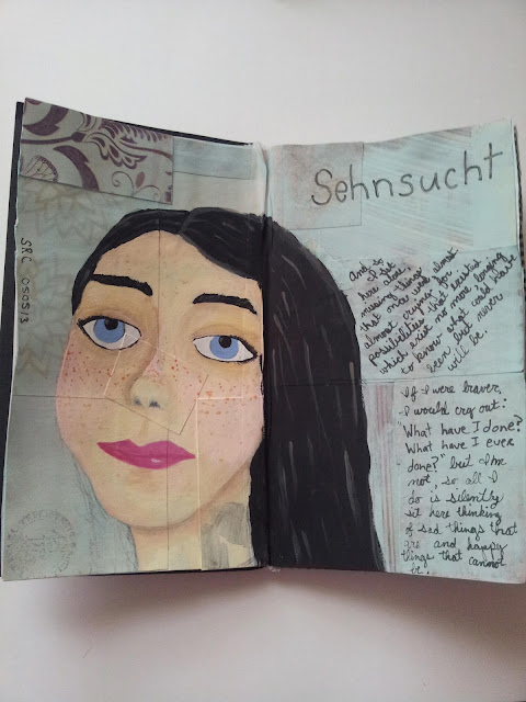
And here's my first two page spread:


There were some really interesting ideas for the photography portion.  I decided that since this is supposed to be exploring self, I would do some awesome bathroom mirror self-portraits.  I feel the need to express how much I am not a fan of having my picture taken.  The whole time I was thinking I might as well be a teenage girl...  It was all I could do to take it seriously and not do the duck face girl look...or the thumbs up cheesy smile look... or the looking off in the distance for some reason look (ok, full disclosure, I did do this one)...  Instead, I did the 'try to make sure my face is actually in the picture look' and the 'I can't see the button, did I just take the picture?' look...  I'm cool like that....

Here's a closer look at just the left page:
I don't have a great printer, and all my photos for this project are going to have to be printed out on it, so we'll just have to get used to grainy photos.  I  tried to use it to my advantage a little bit and make them look like vintage-y photos.  The only one I didn't do anything to is the photo in the middle of this page.  The others I used paint, gelatos, and some other things to age them.    I had done this background a while ago, and , in the beginning, I hadn't planned on using the huge Dylusions journal for this project.  But after doing the poetry prompt, it jumped out at me to work with this background, and I think it works.  I really liked that the stamped girl in the top left was looking down over the page, so I wanted to play with that idea and take it farther.  In the top right photo, I am looking down at my phone (to see if  I am in the shot).  Now it looks to me like I'm looking down at the drawing.  I did the drawing from one of the photos I took that didn't make the cut.  (See, I DID do the 'looking off in the distance for no reason' picture!  *hangs head in shame*)  So I think the drawing looks like she is looking at the middle picture, which is neat because this project is all about exploring 'self'.  I liked the middle picture, because to me it looks like I'm STARING INTO YOUR SOUL!!! BWA-HA-HA!!!  I don't know.  I am not great at thinking about myself although you probably wouldn't guess that from the blog.  In all reality, I guess I don't actually talk a great deal about myself (the deep inner workings part anyway), usually it's the art and then I explain the thought behind it.  This Excavating is like a whole huge Sweet Red Clover bonanza!  

Here's a close up of the right page:
More of my face...I hope you guys love my face, because it seems like you'll be seeing more of it...spattered all over the AJ pages...  I like that there happened to be the peacock feather down in the background I had done.  It fits, because I am pretty proud of myself for going into this thing despite my qualms.  It's been really enjoyable and interesting so far!  And I do love it when I am pushed to go in a direction that is outside my norm...like the photography thing.  Speaking of, I know I am going to have to work on the photography a lot, because these pictures really don't show the brightness of the background at all!  I want to blame it on my camera and say that it doesn't pick up high contrasts well, but really it probably does and I just don't know how to do that yet...I'll work on it.  You know me: practice, practice, practice is my mantra!  On a side note, check out my huge hands!  I swear to goodness, I have ACTUAL MAN HANDS!  They are crazy big, right?!?  ...sorry, that was just a side note...  Anyway, this page has the poem I wrote for the 'Just Write' portion of the chapter.   I stuck with my narcissistic theme and did most of the thoughts starting out with 'I' phrases.

Here is the poem I wrote for the writing portion.  (It's hard to make out in some places in the photo) :

I am a still life painting.
But I am not the color.
I am the black 
the white
the haze
that makes the colors pop off the page
necessary in small doses
but abhorred just the same
for my light and my darkness
neither of which can be discarded
but somehow still so hard to appreciate
"If only she were this instead of that"
or "that instead of this"
but I am not.
Your eyes are drawn away by color
by the noisy crashing of brighter hues.
And you do not really see me.

I begin to see cracks, fissures in my flawed nature
opening wider, 
being pried apart by desperate fingers
spurred on by eyes longing to see what's hidden inside.

I stand resolute but silent:
I am not the song being sung.
I am the catch in the throat, 
the strangled cry.
In my heart I call to you.
I call only your name.

I desire to make sense of  
this curse and gift
like any other, to find meaning 
in things that seem 
so meaningless
so transient, 
so beautiful, yet all in vain


That first part of the poem is what made me think of the bright glorious background I had done in the journal. Then the additions I did, my pictures and the text and drawing and things, were black and white or very bland neutralish colors.  I like that it ties in with the poem in that way.  

I can't wait to see what next week brings about...I'll have a whole week to play with the book this time.  I only just got the book on Friday, and kind of cheated a little by using the background I had done so that I would not feel rushed to keep up...not that you have to do it that way, it's just my slightly neurotic way. Now I'm left with clean blank pages to work on for all the other week...so no cheating can happen!  If the rest of the weeks are as awesome as this first week, I doubt I'll have any problems with 'cheating'...I'm looking forward to digging in full force and really getting down to the roots.

Wow, that was a long ramble!  I'm off to shovel some dirt now...


Tuesday, June 25, 2013

Happy Mail and Some Encouragement

First of all let me just say a big WOO HOO!!!  I got some beautiful mail art today, from not one, but two lovely ladies!  Hooray!

First, from my darling Pamikins:
Two very awesome napkins, some really cool dress shaped paper (I think they must have been from a notepad?), and two AMAZING ATCs!  I love them both so much!  I love that Marilyn Monroe quote, especially that first line "Imperfection is beauty" (read on, because it applies to what I'll be talking about farther down).  And I love the WTF? ATC, that face... "Oh Lawd!"  I LOVE IT!!!  Thank you my dearest Pamikins!   

And from the fantastic Rose:

A fabulous bookmark (oh, I love these so much...I put my other one to good use right away, and, since I am a multiple books at once kind of reader, I will be doing the same with this one!), some really neat numbers (aren't they just too awesome???  I have been plotting with these since I opened the envelope...that 6 and the Paris napkin from my Pam are destined to be together I do believe!), a beautiful note card with butterflies (I love these so much, I don't know where she got them from, but I want to go to that place!) and then the Geisha and Crane piece, which I ADORE!  Thank you, wonderful Rose!

I am always so amazed by the creativity of the wonderful friends I've made online.  They are all so generous, kind and encouraging.  I am so fantastically lucky just to know each and every one of them!  Their kind words have made me so bold in taking chances and trying new things.  I know I would not have progressed as far as I have in so short a time without them cheering me on!

I had promised that I would share some of my beginning drawings with the ladies, and I decided to include them in this post too.  And I'm letting you see the horror that is my beginning drawings, because I want everybody to see that there is ZERO natural talent at work in me.  ZERO.  You won't believe it, but the following drawings aren't even the worst ones I did!  (I covered over the worst of them with gesso, hollered "DO-OVER!" and made art journal pages...so the following ones are the LEAST WORST...when you see them you won't think a person could do any worse, but trust me, there were worse...)

So here are a few of the (least) worst drawings I did when I was starting out:

Look at those hands...are they made out of straw?  Humongous head, little body.  Circular eyeballs.  Check out that nifty hair she's got going on there...look how flat her face is.  What nose has EVER looked like that?
Hand behind the back = I didn't have to attempt hands.  Two different sized legs.  Circle eyeballs again.  Who's hair looks like that?  What is up with those boobs?  It looks like one of her silicon implants is deflating...
So, you can't draw realistically?  Let's make some doll-like drawings then...good grief, how can you screw that up? Let's take note of just how you can screw it up: ..that hand situation...it looks like starfish and octopus tentacles...those are the fattest legs any ballerinas have ever had...do they have gout or something?  but look...eyeball improvement...they're no longer circles at least...  hair is clearly still an issue...  and proportion...
Check out that sweet pear shaped bod this gal's got going on...oh, and the one piece squiggle hair...who drew this stuff, a five year old?  Yuck.  

So, do you see what I mean?  NO NATURAL TALENT.  And the reason I want everybody to know that I have NO natural talent whatsoever, is so that they will know that they CAN draw (or paint or whatever).  All it takes is practice.  Talent is not needed.  Practice is the only thing you need.

Don't get me wrong, I know I am still, by far, NOT the best myself.  But, look at the above drawings, and then look at these: 
OK, she's definitely stylized, right?  But look at the 'before' doll-like drawings...disproportionate and terrible in general...  Now look at her, she's not perfect, but she's mostly in proportion.  The legs and arms do not look like disfigured sea creature appendages...  There is some sense to the hair as well...

OK, so what's going on here?  Still not perfect, right?  The wrong eyeball is bigger.  It looks like she got punched in the left cheek and it's swollen.  Mouth is still not right.  BUT, face has a face shape (it's not just a circle anymore!).  Same with the eyes.  The nose looks like it belongs on a human for once!


And then there's this girl, who I think is the best one I've done so far.  I still have hair issues, but I'm working on it...there is improvement.  Again, more realistic face shape, eyes, nose, mouth...more realistic everything!


I'm not showing you these because I want showered with praise...PLEASE DON'T!!!  I'm showing you because I want you to see that ANYBODY can get better with a little practice.  Again, I know that I've still got plenty of things I can do to improve, and I will keep practicing and practicing until I get to the point where I'm 100% satisfied (we all know that's imaginary...I bet no one is ever 100% satisfied...).  

I just want you all to see that you CAN draw (or paint or whatever), if you are willing to take the time and practice.  I've watched a lot of videos online, and did a lot of research, and I still am on the lookout for more and more.  I LOVE art, looking at it, practicing, reading about it, seeing what others do... I love everything about it and I do SOMETHING every single day.  

From the beginning drawings up above to the more recent ones down at the bottom, only about 6 months or so have passed.  When I look at these images, I can hardly believe that I've improved so much in that small amount of time!  It gets me so excited to think what I'll be able to do in another 6 months that I can't do now!

I guess the point I am trying to make is that six months from now, you can still be sitting there saying  "I wish I could..." or "I'll never be able to..." or you could be sitting there saying "Look how far I've come!"  I know you can do it if you really want to!  All you have to do is try and keep trying!  I KNOW YOU CAN!

OK, I'm getting down off my soapbox now...

Again, I just want to say a big THANK YOU to Rose and Pam for my GORGEOUS care packages!  (You ladies made my day a million times better!!! THANK YOU, THANK YOU, THANK YOU!!!)  And I want to add more big THANK YOU's to all the fantastic folks I am lucky enough to know!  Your words of encouragement are a big part of the reason I can sit here today and say "Look how far I've come!"  Thank you all!

Monday, June 24, 2013

Icads 21-24

What a busy weekend I had!  (That's my lame way to say sorry I didn't post for a couple days...)  In my defense, I actually did have a seemingly action packed weekend.  

There was mailing of mail art.  There was going to Michaels craft store (twice).  There was a MONSTROUS amount of cleaning.  This is what took up the most time...egad, so much time...but the craft room looks AWESOME...and to a lesser extent, so do the kitchen and bathroom.  I mean, how awesome can they look...there's hardly any art supplies in those other rooms at all!  

And there was also art...I managed to get my ICAD cards done.  I also started an art journal page, but I'm not finished yet, so that will have to wait for another post.

So anyways, ICAD cards...  

They are all on 3x5 index cards.  I managed to somehow get confused on the prompts for each day.  I was doing the prompts in order, but I messed that up (no clue how).  I did do 4 cards in 4 days, so that counts anyway, I think.

For the first one, the prompt was 'owl'.  I tried using the video found HERE to paint my card.  The video is really cool, and I could listen to that guy talk all day long.  My girls on Facebook and I have decided I am totally going to marry him, because he has an awesome accent, he's pretty much adorable, he's clumsy (watch the video...he drops something...bwa-ha-ha...I love it!) and he likes art...  How perfect can one person be?  I don't know how my current husband will feel about this, but I'd like to think he'll understand.  Besides, he doesn't have an adorable accent at all, so his opinion is pretty much meaningless...  

Here's the card:


This video is really good.  The man (with the fabulous accent) makes you really feel like you can do what he's doing, and not in a fruit loopy, hippy dippy way (Lawd, I hate when they get all fruit loopy), but just in a nice "it's easy, just try it" way.  With that accent, I believe whatever he says...  Anyway, because I'm a rebel, I added some highlights with white to the owl and to branches especially (in the video, he just has you do the silhouette).  I like the way the branches turned out...the owl, not so much...he looks more cartoonish to me than the branches do.

Next is my ICAD for the prompt "list of pros and cons"...see, I told you, I got all out of whack.  Anyway, because lists are my mortal enemy, I decided that instead of pros and cons, I would just do a 'con' and decided to make a picture of Bonnie Parker, of Bonnie and Clyde fame:

Here's my extremely stylized version of Faye Dunaway as Bonnie Parker.  


Then I made this card, for the prompt 'lyrics or quote', using a video by Jennibellie, which you can find HERE.  Basically, the idea was to 'paint' using string of some kind.  I used embroidery floss:

Once I put down the string, it reminded me of Liza Minelli in Cabaret.  Mostly nowadays, when I think of Liza Minelli, I think of her in Arrested Developement...."I got a case of the dizzies." HAHAHA! 

Finally, I made this card for the prompt 'grocery list':

...because we all know art supplies are more important than food.  These are a few of the things I got at Michaels this weekend (minus the index cards): a set of black Microns, a set of Twinkling H2Os, 5 colors of screen printing ink for fabric, 6 different colors of Silks acrylic glazes, a couple different Sharpies, and some Mod Podge matte sealer.  I got some other things (during the second trip) which didn't make it to the 'grocery' list: some Golden soft gel medium (matte), some Adirondack acrylic paint daubers, and some new paint brushes.  Over all, a fabulous haul.  I've been good for a long time, so I went a little nuts...I'm like a binge buyer when it comes to supplies...nothing, nothing, nothing, EVERYTHING ALL AT ONCE...  Shame on me!

Thursday, June 20, 2013

Page at last and icad too

I finally did an art journal page last night.  FINALLY!  From start to finish (thanks to my beloved industrial strength heat gun)!  And, I suppose, technically two pages.  *insert gigantic sigh of relief here*

I decided that I would start to watch some videos for art journaling and see if I could learn some new techniques, be reminded of ones I've not used for a while, and even to see if I saw something that would inspire me to create a brilliant technique of my own.  

So, last night I sat down and queued up Pinterest and started searching...and then ingeniously forgot to pin the video I watched, so I sadly can't share it with you.  When I stumble across that video again, I promise I will put up the link...and I'll remember to pin the video next time so I can share it with you right away!

At any rate, I watched a video (it was a lady who did a Dyan Reavely inspired video, using Dyan's products/style)and then tried to copy what the woman in the video did.  She did some things I didn't/couldn't do (because I didn't have all the supplies she did) and I added in my own touches as well to get the pages to be 'finished' and more my style.  And here they are:

Started off by spaying the page with fresh lime and black marble Dylusions (I notice people using this color combo a lot, and it looks good when they do it, but I HATE it when I try it...)  Then I used one of Dyan's stencils (which I do have, but don't know the name of...it's the one with the flower edge and dots in the middle) and sprayed through it with the same color dylusions as above.  And then I decided (she did not do this in the video) to use some white acrylic paint and went through the stencil with it as well (because the page was VERY dark in places, and I didn't like that.   Then, in the video, the woman uses one of Dyan Reavely's stamps on a separate piece of paper, and then glues it on the page, but I don't have any of her stamps, so I just drew a girl instead, colored her in with Dylusions and pasted her in.  I used postbox red Dylusions sprayed through the same stencil on the left page to tie in with the headband of the girl. Then I used the mini "Mixed Up Alphabet" stencil and traced out the letters on the left page ("You gotta be kidding me"), with Pitt pen and then colored it in with acrylic paints in yellow and in turquoise to try to tie in the girl a little better...she was sticking out like a sore thumb pretty badly.  Then I took some black acrylic paint and added in the words on the right page ("Can I just be over it now?") because there was too much white going on.  Then I added the dots with turquoise and black acrylic in some random places, outlined some stuff as well.  I used black faux-latos around the girl and then a sparkly peachy one to color in her face a little more (it was a VERY stark white before)...then I took that same sparkly peach and went over the whole page randomly.  And then it was bedtime!

I also got my ICADS done for yesterday and today, just didn't have time to share them.  Both are on 3x5 cards.

This is the one for the 19th, the prompt was 'summer':
I saw a picture of this on Pinterest, and it had these really bright awesome super saturated colors, and I thought that looked pretty summery, so I tried to recreate it on a card.  I REALLY LOVE how the colors look on this.  (Used watercolor and Pitt pen)

And here's today's card, with the prompt of 'poem'
:
"Faces of other people follow me around the room."  This is acrylic paint and then I glued down some faces I made using paperclay (the blueish white ones) and Martha Stewart Crafter's Clay (the purple ones).  I painted their eyes, lips, and cheeks with acrylic.  The poem this is from is below in it's entirety.  I wrote it and it's a double alphabet poem, minus the letter 'x', because there are just not that many 'x' words out there to use...  I always end up cheating and using words that sound like 'x' at the beginning...extreme, extra, etc.

"The Firing Synapses"

And you will always
Be with me, beloved.
Closed eyes call and you answer in 
Dreams that keep you dear to me, 
Ever in my thoughts, even where you shouldn't be.
Faces of other people follow me around the room.
Giddy laughter covers the gloom in me.
Half of my life rots with you, hallow in the grave.
Indecision corrodes the rest.  If only you had not...
Justice, however, won't be served and I'm always jolted back.
Killing me slowly, they keep it up.
Love, they never seem to let me alone.
My memories of you are constantly interrupted,
Not by anything I care for, nothing important,
Only for the sake of this half life I lead.  This open wound
Pouring, barely enough left to keep me going.  Nothing easing the pain.
Quietly, life drains out of me...quick enough I suppose.
Ready or not, when the time comes, you can't resist.
Sometimes I wonder where you are now.  Sickly
thoughts try to make sense of it.
Useless.  I know I will never understand
while I still breath, while I still think, 
exactly what happens, what to expect.
You yearn to know or else try to forget the question.
Zapping your brain, the synapses zero in or else try to disconnect.


So there you have it...if you'd like to read more of my poetry (some is pretty decent, I swear!) you can check it out HERE.

Tuesday, June 18, 2013

ICAD 18 and...did I show you this already?

So two things to show you, that I made quite a while ago, but don't think I showed before.  They're in my scrappy pocket calender journal that I made.  If I shared these before, please forgive the repeat, I have tired brain...


Easy peasy wimpy drawing...I just was pretty happy with the lettering on this one...usually I hate my lettering, because of the 12-year-old boy handwriting, but I am ok with this one.  The lyrics are from the song below:


This is the song, by Fiona Apple, called Werewolf.  I think she has interesting lyrics and she did the artwork for the cover of the album, which I think is pretty cool! :


This is on the page opposite the one above, and Fiona Apple lyrics inspired this one too.  What can I say, I get off on tangents...

This is my actual handwriting.  Horrifying, I know...  I like the way the feet are crossed in this little sketch.

This is the song that the lyrics above are from (for the record, weirdest video ever, but I love it...it's like a big crazy dream within a dream thing...that's my take anyway) :


Also, I think that gal has an interesting face.  I will probably draw it one day...


And lastly, but not leastly, there is my ICAD card for today.

It's on a 3x5 and the prompt today was "Italy":


I did a drawing of  La Bocca della Verita, or 'the mouth of truth', which is in the church of Santa Maria
Cosmedin Rome, Italy.  I don't think this is the best sketch in the world, but the black eyes and mouth do make his look appropriately menacing, I think.

As soon as I saw the prompt for Italy, I thought of "Roman Holiday" with Audrey Hepburn and Gregory Peck.  It's my favorite Audrey Hepburn movie, I do believe.  Anyway, one of the scenes that the movie is famous for is the scene with 'the mouth of truth' in it, and that's why I chose this to draw.  

Here's the scene:

Just an interesting tidbit, Audrey Hepburn was unaware of what Gregory Peck was going to do in this scene, so her reaction above is her actual reaction.  You just witnessed a young Audrey Hepburn freak the crap out...that thought is hilarious to me!