Showing posts with label resist. Show all posts

Wednesday, December 24, 2014

Tempting and Choosing

I don't know if it counts as being an overachiever for JOURNAL 52 since I actually do this quite a lot without it being a prompt, but I ended up with another spread that was inspired by a song this week.

I was listening to this song, "Harlem River Blues" by Justin Townes Earle:


And I fell hard in love and had to make a page.  (Also, if you have the time, check out THIS version, which is a much more stripped down, live version...you can hear a really interesting difference in the way the song feels!)

There's a Tom Waits quote where he says something to the effect of "I like beautiful melodies telling me terrible things." and I guess I must agree with Tom, because I just love this song!  Actually the whole album is great...I've been listening to it on repeat for days.  I tend to do that when I find music I love...I can't help it...I always feel like I've found some kind of secret treasure and I just want to blast this fantastic noise out into the universe and get it into the ears of anyone who happens to be close enough to hear...I just want to share that treasure, you know?

At any rate, here's the page I made:  

"I'm no fool, mama, I know the difference between tempting and choosing my fate."
Egads, that's a brilliant set of words!

It feels like its been a long time since I did any collage type stuff!  It was an accidental collage situation...I was doing a gesso resist technique and apparently I got a little heavy handed with the water and my page started to peel really bad (you can see it a little in the middle bottom on the right page)...so there was some stealthy collage work that managed to happen, and I really like the spread.  

There will almost always be a shout of "Huzzah!" from me for happy accidents...and, usually, the especially 'Huzzah' moments end up happening for the times I am most angered by the initial accident!

 I think 'this is going to be so cool!', then the accident happens, cursing my fate and shaking my fist in anger comes next, and then I generally figure out a way to fix it and usually end up liking it better by the time I'm finished...not always, but often enough that you'd think I would less prone to fist shaking and fate cursing!

There's probably a life lesson in there about how when things don't go as planned, we shouldn't freak out, but instead, take a breath and figure out Plan B...there are, after all, very few times when things are as bad as they first seem.  That whole "Keep calm and carry on" mentality has merit to it...even though sometimes I'm much better at 'freak out and fall over'...haha...

-


On an unrelated note, I was wondering if you could help me with something.  

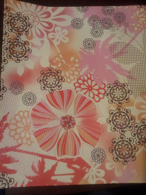
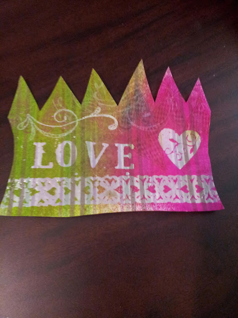
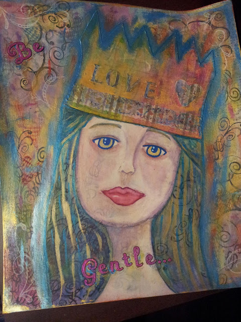
I've been pondering over the pictures that I share of my art stuff and questioning whether I like the close-up, cropped views (like the picture in the beginning) that have been my go-to for a long time.

I am wondering if I would be better to include the un-cropped picture instead.

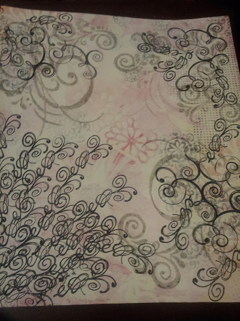
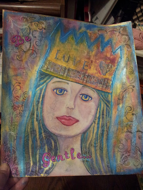
I was looking at the not cropped version of today's page:

Is this better?

...and thought that it gave the full effect of the spread a little better than the close-up cropped version did...they're the same picture, but they look miles apart.

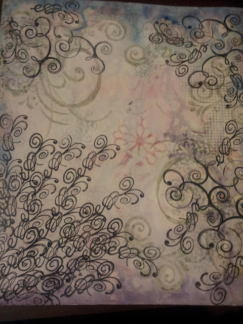
And then I wondered if the extra stuff that I propped my journal up on (not because it needed propped up, but because my studio is a hot mess and its easier to prop it up on the stuff than to find an empty space...) was distracting or weird or in poor taste or something, so I kicked the stuff out of the way (like an adult) and took this picture:

...more clean floor space than my studio has seen in a long time...

...of the journal on the floor.  I just realized that I could have fibbed and said 'table' instead of 'floor' and then you wouldn't have to know how bad I am for having piles of stuff stacked on every available surface...but you're my friends and I just can't lie to you...

Anywho...I was just wondering if you had any sort of preference between the three photos in the post today...or if you have any other alternatives (that don't include me keeping the studio clean...I mean, let's be realistic ☺), I would welcome them with open arms and much appreciation!


Sunday, July 28, 2013

Layer on layer...

I'm a prompt!  I'm a prompt!

OK, so here's the story: In one of the groups I'm in on Facebook (M3 shout out!!!), we were having a discussion about layers.  They are awesome!  Yes...BUT they are not the easiest thing to learn!  So, one of the ladies was asking about how people in the group do layers.  And as it turned out, we all had layer issues!  I'm so happy, because I thought I was the only one!  Layering has been on my ever growing list of things I need to work on for a LONG time.  But I have been practicing...

I am DEFINITELY NOT an expert (at anything...besides maybe practicing...), but I mentioned that one thing that is helping me is to start out with things I don't really like.  I mean, you don't want to cover up beautiful gorgeousness, right?  Because then you could mess up your totally awesome whatever-it-is and be really sad!  However, if you start out with something you're not really a fan of, and you mess it up, it's not really a loss, because you didn't like it (and, let's be honest, if you don't like it, you'd never use it anyway). So, to my shock and glee, they made that into a prompt, to work on layers by starting out with something you don't like.  (I actually can't leave my craft room because my head won't fit through the door!)

What I thought I would do is take some pictures to show how I arrived at the end result...so here you go: 

This is a piece of scrapbook paper from one of the first paper pads I ever bought.  The rest of the paper from this pad is pretty awesome, but this page has always made me gag.  I don't know why, but I REALLY dislike it.
For the first step I glued this (HIDEOUS) paper to a piece of thin cardboard (think cereal box weight). 
The next step was to apply a thin coat of gesso to try to tone down the brightness of the paper (did I mention how ugly the paper was to me...oh lawd, so ugly!)  After the gesso was dry, I used a large scroll stamp I had and some Dove Gray Stazon ink for the next layer.  Then, I used Jet Black Stazon and a few different scroll stamps over that.
In this step, I used several different colors of Distress Stains to add some color to the gesso.  For the record, Distress Stains are REALLY awesome, and one day, I will own all the colors.  At this point, I decided I was going to do a girl (because what do I make besides girls, really?)...
So, since I decided I was going to do a girl (something I do A LOT), I thought I would change her up a little bit and try some things I don't usually do...and that's where this scrap piece of paper came in...
First, I embossed some stamps onto the page...well actually I cut out the shape first...but then I embossed with clear UTEE.  Then, I used some Dylusions spray inks to color in the piece.  Because of the embossing powder, the stamped images resisted the color, and so the images really stand out.  Then I added some more stamps (there's a heart one that blends into the background and then the white scroll thing).  (This is the point where I took the above picture.)  But, this looked too bright for what I had in mind, so I toned it down with some of the White Linen Dylusions.
While waiting for that to dry, I set about adding paint to the background, followed by the heart stamp, and then followed by the  white stamp as well.  I kind of wanted to stop here, but seeing as how this was about layers and all for practicing, I went ahead with my plan to put a girl on the page.
I made a quick sketch of a girl face outline, took a little bit of gesso and painted her in.  I only put gesso on the actual face/neck part, because I was hoping to preserve some of the background (which makes me super happy!)...
While waiting for the gesso to dry, I kept looking at this piece of scrap and decided that, even after I added the white Dylusions, I STILL didn't like how it looked in relation to everything else, so I went over it with some Inka Gold Metallic Rub in Gold.  That stuff is pretty darn awesome by the way...  I ended up liking this part much better after adding the Inka Gold.  This is the point where I got REALLY into it, and forgot to take anymore pictures until I was done...but you didn't actually miss that much craziness...or at least none that you really need pictures of for explanation...
After the gesso was dry, I lightly drew in some features in charcoal.  I used some Letraset Aquamarkers to colorize.  Those things are so amazing it HURTS!!!  I will TOTALLY be having all the colors of the Aquamarkers...I know I said that about the distress stains, and one day I will...but the Aquamarkers...I will be owning all of those REALLY soon!  Basically, Aquamarkers are watercolors in marker form, but they are so amazing that I think they are actually made up of fairy dust and love from puppies.  I LOVE THEM!!!  ...ok, I'm good now.  I digress.  After I finished the face (and the Aquamarker celebrating...it was the first time I used them, I just got them yesterday), the hair looked a little flat and so I took some of the Inka Gold in Gold and added some hair lines.  I also added some Aquamarkers to the embossed areas of the crown because they were sticking out like a sore thumb...the Aquamarkers tamed them a little.  Then I added some Inka Gold in Gold around the edges and in random places on the page.  But I wasn't happy with that, the gold was too overpowering by itself, so I added some Inka Gold in Steel Blue as well.  Then I thought I'd really like to have a sentiment.  "Be Gentle" popped into my brain.  I was having trouble deciding which set of letter stickers to use for this: a set of shimmery black ones or a set of light rose color ones.  I chose the light rose ones...I chose poorly.  They REALLY blended into the background, and NOT in a good way.  So I went over them with some Inka Gold in a couple different colors...and I still wasn't happy with them.  Then I thought 'what about using the Silks acrylic glaze?'...because is there anything a little Silks can't do?  I used the Jasmine color and that was definitely the right answer.  I love those things (and yes, one day, I will have all the colors of Silks as well...)
Here's another finished photo, just to show the shiny of it.  I am pretty impressed with the end result...  While I was looking at this, I realized that I am kind of like Alice from Alice in Wonderland.  'I give myself very good advise, but I very seldom follow it'.  Starting out with something you don't like is pretty good advise...but I get lazy and don't practice it as often as I should.  Then I look at this and realize that I need to do this kind of thing more...I love how it turned out!  I really like that you can see pieces from every layer.  There's the hideous scrapbook paper, which you can see on the left side (there are little dots that come through).  There's the stamps in Dove Gray and Jet Black.  The paint, the white stamps, the crown with the embossing.  The Inka Gold in Gold and Steel Blue, and the letter stickers colored in with Silks.  I love that you can see some of the stamps coming through on her face and in her hair! 

All in all, I am really happy with the way this turned out!  It's significantly better than that (UGLY) scrapbook paper I started out with in the beginning.  And since I started out with something I didn't like, I wasn't worried about messing it up.  This gave me some extra freedom to experiment and not worry about the end result too much.  And I think that made the end result much better.  I really feel like I am a successful prompt!  I can't wait to see what the other ladies have come up with!

Sunday, March 10, 2013

Perhaps you did not know...

I've been a busy little bee this weekend...doing some artsy things like playing with my Dylusions stuff (I'm still not over these, I love them so much!), starting and finishing some pages, trying new-to-me techniques on ephemera and trying some new mediums as well, making some jewelry...and visiting the Russell Stover outlet in Gatlinburg, spending way too much money on chocolate factory seconds.  My husband says he doesn't like the term 'factory seconds' when referring to food, because it sounds like your eating something someone else has already taken a bite of...the Russell Stover outlet people apparently agree, because they call them 'bloopers'.  Either way, it all tastes like chocolate and I am currently trying, with much difficulty, to type a post and not get melty chocolate on the keyboard...because then I will have to lick it off...don't judge me too harshly!  Perhaps you did not know I have no shame when it comes to food...

Let's abruptly change the subject before this goes too far...  Oh look, pictures! :

Quote from Dorothy L. Sayers

Ah, I do love my quotes...and this is a good one.  This page was my warm up.  Perhaps you did not know, but warm ups are what you call things you're not quite happy with...they are not mistakes...they are warm-ups.  I think this is salvageable  but I'm not utterly thrilled with it, so it will have to be added to in the future, I think.  Maybe if I threw some doodles in there?  I don't know...we'll see what happens...

Pomegranate stencil from Julie Fei-Fan Balzer (mini size)
Perhaps you did not know, I will spend ungodly amounts of money I don't have on art/craft supplies...I fear it is my greatest flaw.  I've decided that I am the embodiment of the quote "I myself am entirely made up of flaws stitched together with good intentions."  I can't help myself.  In my defense, I don't ever spend money on useless things like clothing or make-up or hair cuts (I do them myself...I feel it gives me an edgy 'artistic' look...and pony tails can cover a lot of mistakes...I mean warm ups...) or cleaning supplies...so I think I'm justified in buying more art/craft stuff...  Most recently, I got some stencils so's I could play with my Dylusions in a whole new way.  I've also been hoarding plastic packaging, so I'm eventually going to try to cut some of my own...we'll see how that goes...

Along with the stencils (because free shipping couldn't be achieved without spending $50 or more and because I really wanted one), I got one of Dyan Reaveley's Creative Journals.  Let me just tell you, this is a big honkin' momma of an awesome art journal!  Especially considering all my other journals are 7 by 5 or smaller and spiral bound (except for one), so two-page spreads are practically impossible...  the pages in Dyan's Creative Journals are 11 3/8 by 8 1/4 and stitch bound, so I could do a humongous spread!  Oh, the excitement!  I started putting down some stuff on Friday and here's what that looks like:


In the middle of the pages you can see the Cornflower stencil (Julie Fei-Fan Balzer's design...So far, this is my favorite stencil I think...) and I also used Dyan's Dotted Flowers stencil, trying the 'ghosting' technique for the first time.  I like the much more demure look of the ghosting technique.  I think I got a little heavy handed when doing the Cornflowers stencil.  I'll have to see what I can do to make it blend in a little better...Let's call that part another warm up...  But oh, swoony swoon for the fun I've been having!

I also did this page, just fooling around so I wouldn't waste the ink on the stencils, but I really like it.  I'll have to use it for something:

This picture doesn't do it justice...it's much more awesome in person...maybe I'll cut it up for ATCs?  Hmm...


Before I got my Dylusions, I was messing around with alcohol inks and perfect pearls, making my own sprays, and here's a girl I did using the sprays I made:


Ooh, she's so SPARKLY!

I used kraft paper for her face, and I really like how that looks!  I also used modeling paste for her hair, so it's heavily textured.  The only downfall is that when I sprayed some of the perfect pearls spray on, it ended up pooling in the texture and it looks like she's got some really bad dandruff going on.  I'm going to try to hit it with some Head and Shoulders in the form of the black Dylusions and maybe that will help...  You should see how very sparkly she is in real life!  I'm not a huge fan of 'bling' or glittery/sparkly stuff, but I do have to admit I like the Perfect Pearls (I have the little tubs of them).  They add more of a magical gleam than a big glob of shiny, I think that's why I enjoy them...


First time doodling with charcoal...
This is my partway finished page for the Creative Every Day challenge (you can read about the challenge HERE).  March's theme is Black & White.  I tore up some book pages and used gesso to glue them down (the green is a different page...I forgot to stick something in between when I took the picture...this page is all black and white).  Then I just used some charcoal to draw a girl and hit it with some hairspray so it wouldn't smudge accidentally...I really need to invest in some workable fixative, but hairspray works for me till then.  I really like the way you can see the texture of the book pages. I am pretty happy with the shading...I think that's the best part about the charcoal is you just (on purpose) smudge it around and you've got interesting shading!  I bet the worst part about charcoal is when your smudging happens not on purpose...  I am not satisfied with her eyes (they are creeping me out a little...) so I think I am going to try to use some ink and a couple other things to fix them...I'll experiment till we find what works... Perhaps you didn't know, but experimenting is my favorite!

Speaking of experimenting, I tried a new-to-me technique:

Crayon resist fun

I took one of my embossing folders (you could use anything with texture if you don't have embossing folders) and stuck a book page over top.  I rubbed that with the long side of a crayon and then sprayed it with ink.  The crayon resists the ink.  I think this is a crazy amount of fun!  You could also just draw or write with a crayon (or anything waxy...or probably elmer's glue...I bet there's a ton of stuff that would work) instead of doing a rubbing.  And instead of spray inks, you could use watercolors or gouache (maybe even thinned acrylics)...again, there's probably a million things you could test out.  The one in the picture is the most successful one I did, I believe.  I tried using a yellow crayon with pink ink, and that gave an interesting look.  It was just fun whip out the crayons and not know what was going to happen until you sprayed the ink!  Perhaps you didn't know I'm just a kid in a grown-up body!

Finally, I made a kitchen sink necklace inspired by the lovely B'sue of B'sue's Boutique (and who is a friend of my sisters!).  Perhaps you didn't know art journaling is not my only creative endeavor!  You can find out a little more about kitchen sink jewelry from B'sue herself HERE.  And she has a ton of tutorials on YouTube, if you'd like to do some neat jewelry!  And her store (HERE) has a lot of unique supplies, reasonably priced.  This is not a paid endorsement (although if she wants to send me some free supplies, I would not say no...), I've never actually met B'sue...she's just got some neat ideas so I thought I'd mention it...  At any rate, here's my kitchen sink necklace:

All spread out so you can see the individual bits and bobbles

I can't decide whether I should put it on a different chain so that it spread out like the picture above, or if I should leave it like it is and let it bunch up like it does here:
How it hangs on when you wear it

Or maybe I'll just have to make a whole new necklace...there just needs to be more time in the day!

So, what did you get into this weekend?


Friday, March 8, 2013

Prompt6ix #10 Page

I just finished my Prompt6ix #10 Page (you can read more about Prompt6ix  HERE):

It is BRIGHT!
Before I go any further, I just gotta say how much I love the Dylusions spray inks.  They are so easy to use and in great colors...  I've had a fun time experimenting with them!

This is the first time I've done a two page spread.  It was a little difficult because I did it in the journal I made, and there is a hump where the pages connect...I think it would have worked a little better in the middle of the journal, as opposed to close to the beginning, which is where I did it...less of a hump in the middle of the book (or on one of the middle pages of a signature), but I didn't think about it and here we are...  I don't mind so much, but I will know for next time.

Here's a close up of the left page:


And the right page:


This is the breakdown of the six prompts and how I used them:
  1. Lyrics- I have lyrics from 3 songs on the page, "Your Color" by Mama Kin ( 'The silence pushes into me'; 'You go your way and I'll go mine.'; 'Now my footsteps echo in the hall'; 'I miss your color most of all' ), "Don't You Cry" by Guns and Roses ('You'll be alright now sugar.  You'll feel better tomorrow come the morning light...'), and "Set Fire to the Rain" by Adele ( 'I can't help myself I'm looking for you').  I love this prompt to use lyrics in the page...  I am a lyric junkie!
  2. Museum- Is in the journaling, which says: 'I realized my mind was some sort of horrible museum where no one curated the archives of what stayed and what faded away.'  Those are my words, inspired by this image:You can't choose what stays and what fades away ... that I saw on Pinterest
  3. Kaleidoscope- For the background, I cut out a paper snowflake and used it as a stencil!  That was A LOT of fun, and I am going to have to do that again!  ...and improve my snowflake cutting skills...snow flake intricacy, here I come!
  4. Tag or Label- On the left page, there's a label (that has the G&R lyrics on it)...I hand cut two bigger labels to go behind (the blue and black outline) the label punch (green part) that I already had to try to balance out the black of her hair on the other page.
  5. Lime Green- In the background and her hair and the book page ephemera...again, I love you, Dylusions spray inks!
  6. Tape- I used some washi tape with music notes on it that I had.  Woo hoo for kismet!

On a side note, the other night, my husband woke me up by violently shaking me and was saying: "I let it out!  I let the snake out!" over and over...  He had apparently been dreaming some really weird dream about a snake being lose in the house and crawling under the bed...he was freaking out!  After I realized the house wasn't on fire and there wasn't an serial killer in the house, it was hilarious! 

I think I must have been thinking about that when I was doing her eyes, because now when I look at her, I think she has creepy snake eyes!  Maybe it's the lighter color around the pupil?  I don't know...I may have to revisit those eyes and see if I can make them less snaky.


Monday, January 21, 2013

Newbie


Hi!  I'm Amy, and I'm a crafter...

I do many things, but most recently, have been trying art journaling a bit.  I just wanted a place to share some things, so please feel free to comment and give advice, opinions, or ideas!