Sunday, January 25, 2015

In Our Own Way

My sweet friend JACKIE (AKA MY HONEY) nominated me to participate in a little challenge, where you share pictures of some of your older art.

This has proven to be a little difficult for me, because I've only been sincerely arting it up for a few years...and shared 99.9% of my art here on the blog...so you've probably already seen it!

And then I wondered if I've ever shown the canvases I did in the past...and I think the answer is no, so here you go:


I copied this mermaid from something I saw on Pinterest...so long ago I have no idea who's work it was, so I apologize!  I was really pleased over how she turned out at the time...now I see all kinds of things I coulda/shoulda/woulda done differently.  I guess it just goes to show that I've gotten to be a better artist over time!
This girl is the same way...all the stuff I learned between then and now is calling my name!  I do still enjoy her hair (which is scrapbook paper!) and I still find her mouth to be saucy and happy-making!  Also, I just noticed that dry erase board underneath the canvas says November...I just looked over at it...it actually says November 2012...clearly I don't use that dry erase board as much as I once thought I would...
The background on this one was my favorite...and the sentiment is one that I stick by too!  I used alcohol inks to make the background on all these canvases and this one looked like plaid to me and made me very happy!

All three of these canvases are hanging on the wall in my studio...they remind me of how far I've come in my art!  Even my lettering skills have improved since then, despite the fact that I've not really practiced it like I claimed I would (and keep claiming!)...this must support my theory that any kind of art practice improves your art over all...so I may not have been practicing lettering, but I was fiendishly practicing other things and better lettering was a happy byproduct!

Before taking up art/art journaling, I was creative in other ways.

Like sewing:

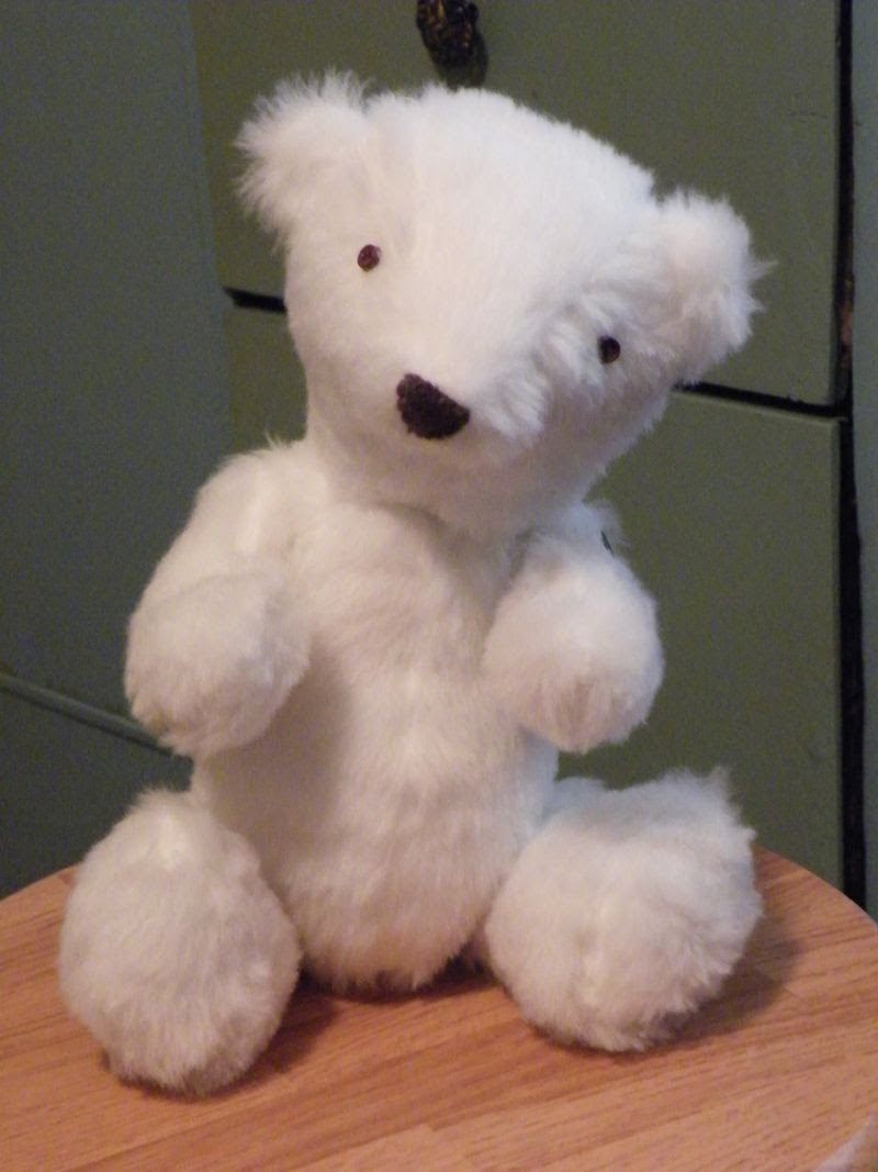
Made for my nephew Michael, from a Simplicity pattern.


Made up my own pattern for her!


Made from a pattern from a book called Wee Wonderfuls, which is a FANTASTIC book on soft toy making!  


I also embroidered:

Elephant, from a pattern


From my imagination


Crocheted:

Actually, I crocheted A LOT...this was from a pattern from LUCY AT ATTIC24...at one point, crochet was like art journaling is for me now and I was quite the little busy hooker! (haha)


And I did dabble in painting as well...just not the journaling kind:

He's a magnet...he still makes me laugh every time I look at him!


And this is Stanley, my Mom's "gentleman caller"...also hilarious, in my opinion...

I was thinking about all my past arting and crafting as I worked on this week's JOURNAL 52 spread.  (The prompt is "Silhouettes".)


I decided to use some of my MANY stamps that I never use...

While I've not always been an art journaler, I have always been a creative person.  My sister and I used to joke that I was "a craft acquiring junkie"...if I saw it and liked it, I had to try it...HAD TO.


I love those little stamp gals...so cute!  I went over the stamp lines in black marker to darken them and to give them a more 'drawn' look...it's a great way to cheat if you're not good at drawing, plus tracing things will help your hand get the feel of drawing, which will help you be a better draw-er...it sounds crazy, but it's true!

Now I think I must have just been searching for the right thing for me.  Don't get me wrong,  I do tend to love all things creative...and there was a time that I thought making soft toys was my passion and that crochet was my one true talent...but when I started art journaling...OH BABY!  It's a whole different kettle of fish!

"We must all be beautiful in our own way."

But that doesn't mean those years spent on other creative endeavors were wasted...or that sewing or knitting or jewelry making or writing or any other creative act is any less artistic.  It only means that we can define art in many ways...and that they are equally valid and important.

When I look at my beginning art stuff, I cringe a little, because I can see so many flaws.  But, while I do see those glaring flaws in my work, I can say that those works are still beautiful in their own way. All those flaws led me to become better.  In a couple more years, I will look at my current work and hopefully be able to say that it too is flawed but led me to improve even further.  

Sometimes the beauty in our art is not in the outward appearance of it.  Sometimes the beauty comes from a hidden meaning only we know.  Sometimes it comes from the years of hard work it represents.  And sometimes it comes from the fact that we were brave enough to try something new.

So my spread today is meant to encourage myself (and hopefully you too!) to find the beauty in everything around me, especially when it's not readily evident.  

Thursday, January 22, 2015

OK O'Keefe

This week's DOCUMENTED LIFE art challenge was The Color Wheel and the prompt was this quote from Georgia O'Keefe: "I found I could say things with color and shapes that I couldn't say any other way..."

Let  me just tell you, me and this spread fought really hard with each other, and either the spread won or it was a draw....  I just couldn't get inspired!  Don't get me wrong, I think the prompt and art challenge were GREAT...but for some reason, no matter how hard I racked my brain, I wasn't getting it!  

I ended up putting color on the page, thinking something would come to me once I did that:

I did actually really like the left page...the cool colors were really neat...but that left page...ugh...it just wasn't sitting right with me...

NOPE!  Still nothing...

Finally, I just scrolled around on an O'Keefe Pinterest search and found another quote of hers that I really liked:


"I have already settled it for myself, so flattery and criticism go down the same drain and I am quite free." -Georgia O'Keefe

I just thought this quote was a good reminder to be true to your own vision...whether in art or in life.

I suppose it might be odd to some, especially because we all love to be praised for a job well done, but I really agree with the idea of not letting ourselves be affected by flattery in the same way that we wouldn't want to be too affected by criticism.  Just like everything else in life, I think it's wise to take praise in moderation.

I'm not saying it's a bad thing to be taken note of when we deserve it...it thrills me to the core when that happens to me!  

Praise is kind of like a drug though...the more you get, the more you want...and that can lead to a problem because you can find yourself doing things you don't actually want to do or that you don't enjoy doing just for the pat on the back you'll get.

It's why I love O'Keefe's quote so much...the idea of 'settling it for yourself' so that YOU are pleased and free to do what YOU like and enjoy...that appeals to me so much!  What an excellent way to be able to live happily.  

I love my dogs very much, but I'm not like them...I don't need that pat on the back to know I did right.


So THAT'S WHY I didn't like you right page...

In the end, after looking at this spread for a good while, I finally realized what it was that kept throwing me off.

I should have flip flopped the colors on the right page...so the yellow and orange would be to the far right and the pink and red towards the middle...then it would have a pattern that progressed from the darkest to the lightest colors and my brain would have been much happier!  It would have been like the colors were leading you to the next page!  

Of course, I see that the way I did it now is also a pattern, with the darker colors on the outside and the lighter ones within, but I know I would have liked it better the other way...so that's why this is my OK O'Keefe spread and not my fantastic O'Keefe spread.  (On the positive side, OK O'Keefe is sort of word play, and I do enjoy that!)

Oh well, you live and you learn, right?

Luckily for me, there's always more paper and more opportunities to settle things for myself!


Monday, January 19, 2015

Put a Lid on It

The prompt for this week's JOURNAL 52 spread is: "Create a page inspired by a conversation you've had or overheard in the past week or so."

Can I just say how much I love this prompt!  I plan on having a go at becoming a really good listener from now on...then I'll have a whole journal full of funny things I've heard in conversations...I live among southerners, and their crazy expressions would be enough hilarious fodder to fill several journals easily!

I figured to be fair about it, I would make my first 'overheard conversation' page about my own crazy conversation...it's only ok to laugh at others if you can laugh at yourself in the same way, right?  Don't dish it out if you can't take it!  (Puns...hehehe)


"And they'll all have matching lids..."


The conversation that I chose to document was me talking to a friend of mine at work about my dream to someday own a set of Rubbermaid/Tupperware containers.

I didn't realize exactly how silly the whole conversation was until I saw the look on my friend's face...and then I recognized the crazy person look that was probably on my face...


I am loving my Neocolor II's lately!  They are so bright and pigmented and awesome!!!

The reason I'm obsessed with this is because I can never find a stupid container with a lid that fits it anywhere in the house.  I think, after the sock monster that lives in the dryer, the lid monster is the number one danger to household management...


It's really bad when you start thinking that your dirty brush water is a pretty color, isn't it?

The problem lies in the fact that, aside from not having lids, the containers I have are still perfectly fine...so I can't throw them away, right?  *says the crazy harder*  And then cupboard space is at a minimum, so there's no room for new Rubbermaid if I don't throw the old stuff out!

Do you see the conundrum I'm in?


I love these colors...I could just squeal with delight!

I actually think this problem stems from not being used to having extra moolah...the whole don't toss it if you can use it thing...which is a perfectly good way to be.  Except for now that I have a little extra moolah...at least enough for a new set of Rubbermaid containers...I find that I'm having a hard time letting go of the lidless wonders that have carried me through to this point...as though these inanimate objects were my dear friends...and now you see why my work friend (who is a real person, not a Rubbermaid container, just for the record) was looking at me like a maniacal weirdo...and why I had to make a page about this conversation (except I drew some vintage Pyrex instead of Rubbermaid, because, frankly, Rubbermaid is not as cute.)

 Someday, I will have microwaved my lidless Rubbermaid containers into oblivion and I will get my new set with their fancy matching lids...

So maybe the moral of the story is that it's just as well to have small dreams as it is to have big ones...because, one day, my dream will come true and, after all, how many people can honestly say that?


Thursday, January 15, 2015

At a Snail's Pace

For DOCUMENTED LIFE this week, the art challenge was Gesso, and the prompt was: "The beginning is always today." -Mary Shelley

In keeping with my inadvertent wild kingdom theme, here's what I made:

A not-to-slimy snail!

I really liked that Mary Shelley quote, and I'll probably use the actual quote on some other journal page.  It brought to mind the fact that every day is a fresh start and a chance to do things differently...it's never too late for that and you never have to wait, you can just begin...


"It all starts here."
I used a tutorial I found on Pinterest to draw my snail.
You can find it on my board called "Draw".

I was thinking about that quote as I made my snail's shell.  I liked the way it spirals out bigger and bigger.  

I was thinking about how beginnings can be like that as well.  You start off slowly with something little and you gradually build on it and build on it and, over time, you find you're not at the beginning anymore...in fact, you're very far away from where you first started!


It's important to start from your heart!

At the center of my snail's shell is a little heart.  I think that must be where all things truly begin to take shape.  

If you'd have asked me in the past, I would have said everything starts in your mind.  You form an idea and plan and dream and all that and that's the start.

But I think I was wrong.  I think that it's all just an illusion at that point.  It's not quite real.

It's only when your heart gets involved in something that it has a proper start, because it goes from being a dream to something else...something you know you have to accomplish.  Sure, your brain is involved as well (hopefully anyway!), but it's not till your brain connects with your heart that you really start to create something.

I think that's the point where I'm at now...where my brain and my heart have finally connected and I know, both mentally and deep down inside, what it is I need to do.  It's a wonderful and slightly scary feeling and I'm interested to see where it takes me!


Monday, January 12, 2015

Things To Be

For JOURNAL 52 this week, the prompt is: 

"Think about the word 'being' and what it means to you.  This might mean being yourself and what makes you who you are, the things you do, or being present in the moment."

Here's what I came up with:

That clean water jar is a lie...I washed it just for you!

When I thought about this prompt, I knew pretty quickly what direction I wanted to go as far as the art went...


A little closer...this one is the most true to color...

...it would fit right in with my all-things-fauna theme I've got going so far this year... (I really hope insects count as 'fauna'...I mean, they're not 'flora', so they've got to be the other one, right?  That's what I'm going with anyway...)


"The best things to be: patient, smart, brave, kind."

I knew I wanted to draw a bee and have his black (thorax?) lines be words instead of just lines.  I felt like that was a pretty cool idea...

I do think he looks more like some sort of crazy wasp than a bee though...I think it's the crazy colors that make him more waspish...especially the green wings.  And possibly the blue-instead-of-black stripes...  But I do like the bright colors!

I wanted to make the letters really fat so that from farther away it would be hard to tell that they were words instead of stripes...which I think I succeeded at.  Unfortunately,  poor 'patient' is a little hard to read...I think it looks like it says 'pazzeni', which I don't think is really a word...but lets lie and call it Italian for 'patient', ok?  

Actually, if you took out the 'e' and 'n', it would be "pazzi" which actually is an Italian word...it means 'crazy'.  I only found that out when I googled 'pazzeni' just to make sure it wasn't some sort of foreign swear word...  It was a funny coincidence, because 'crazy' is a pretty accurate description of me, so whether you choose to read it as 'patient' or crazy, it's still true...

I tried to pick words for my bee's butt lines that describe what I am now in a small way, but also what I hope to practice this year.  "Being" is a verb, and (if elementary school English lessons aren't failing me) verbs are action words.  

I know a lot of people say the term as a kind of acceptance word...like "being present in the moment" or "just be"...which makes me think of a sort of stillness.  

I look at it more like this: "I am being patient/smart/brave/kind."  I think of it as practice...and once I practice enough, then I will actually become those things.  I will be able to say honestly that "I am brave/smart/patient/kind."...instead of just acting that way.

I like to think that at times I am all of those things...but not always.  I don't always make smart decisions...I'm not always brave enough to act...I don't always have kind thoughts...I'm not always patient as a saint.  And no one is going to always be those things...but I'd like to be those things more often.

I think that emotional and mental progress is kind of like trying to swim upstream...if you don't keep kicking, the current will pull you back to where you started!  It's not good to tread water too much, instead you've got keep moving forward, little by little, to get to where you want to be.

That's why I want to keep practicing 'being' until, one day, I just am.

Thursday, January 8, 2015

Two Wild and Crazy Guys

Last post, I mentioned that I was working on my Documented Life cover for 2015's journal...which is very mischievous and irresponsible of me because I haven't done 2014's covers yet!  (I will, I will!)

Well, I finished up last night and here's what I did:


The front cover of my 2015 Documented Life journal!

I always seem to have trouble getting accurate colors to come through on my camera.  I'm pretty sure it's user error...like not understanding lighting or something.  This next picture is much more true to color:


SO CUTE!!!  *shameless self-back patting!*

I really enjoyed working on the cover.  It's thick cardboard, so it didn't bend or curl up when I put the gesso on or when I was working on the subsequent wet layers...that non-curling was VERY nice!

Here's what I did on the inside of the front cover:


Quack!

I learned a little lesson from when I painted the cow from last post, which was to stop being impatient and go ahead and gesso the page, the results are much better!  I didn't do it on the cow page because I didn't want to wait for it to dry, and when you don't use the gesso, the Neocolor II's just kind of sink into the page and become more muted...they're also harder to shift around and blend.  When I worked on these two pages, I gesso-ed them.  I like that adding the gesso layer lets me get more movement out of the paint and I think it makes the colors brighter/bolder as well.

On these two pages, I also learned that I should do an initial layer of color with my Inktense pencils...because I like how that looks much better.  You can kind of see the difference in the backgrounds of the pages especially.  

On the bunny page, where the orange background is, I did a layer of yellow Inktense underneath and it comes through a little.  On the other hand, on the Duckling page, the purple background has just the white gesso underneath...you can see it in the places where the Neocolors are too thin.  I think it's a personal preference kind of thing, but I just think the bunny looks a little more dynamic and lively, and my guess is it's because of that under-wash of color.

I think the duckling is cute, but I am REALLY in love with that bunny page!  As always, you can see the reference photos I used on my Pinterest board called "For Your Reference" (There's a link to my Pinterest stuff in the sidebar.)

Now that I've got my 2015 cover done, I'm going to buckle down and finish my 2014 covers...I'm not really finished with those journals till the covers are done, right?  And I'm SO CLOSE to my goal of not being a flake...I don't want to mess up now!!!  So look for that post to come in the next couple days...

Just a quick side note: where I live, the temperature today is 1...with a windchill of -20...so I hope wherever you are, you are staying warm and toasty and that you will send me warm and toasty thoughts...I need them today! <3<3<3

Tuesday, January 6, 2015

More From The Farm

I've been caught up in a wave of domesticated animals!

There's been a horse, a goat, a chicken and now this guy:


I must find animals very moving...  Get it?  MOO-ving?  Hehe! *groan!*


I used this cow as the main reference for mine:


Bet you can't touch your nose with your tongue!
You can also see him on my Pinterest board called "For Your Reference".

I went with a non-hairy version for my cow though.  

Originally, mine was going to be very hairy also, but then I didn't gesso the paper that I used to paint him on.  I used Neocolor II's to paint with for the most part and they move really nicely over gesso.  Not as much movement happens when there's direct to paper contact...which was disappointing, but did lead to a less hairy, but still cute little brown cow...

The little cow is on the first page of my Documented Life (DLP) journal...the opposite side of the paper as the chicken.  I wanted both pages of the chicken spread to be on the same kind of substrate, and so I had to put the chicken on what will actually be the second and third pages...  This meant that the first page in the journal was blank, and so I decided to try my hand at a cute cow and here we are!

Completely out of character for me, I've also started working on the cover for 2015's DLP journal...which means I'm very naughty indeed, because I haven't yet done my 2014 covers for DLP or J52!  For shame!!!

Usually I wait until the end of the journal to decorate my cover...that way I won't mess up what I've done on the cover when I'm working in the rest of the book.  

BUT, since I deconstructed my DLP book for this year, that won't be an issue.  It's actually the opposite problem this time, because if I wait till the end of the year to do this cover, I'll risk messing up the inner pages!

So I'm taking away ALL risk involved and working on the cover for this year right now and then I can start the 52 week process of reconstructing my DLP journal!

I should have the cover done in the next day or two, so be on the look-out for that...AND then, I need to finish my 2014 Journal 52 cover (and decide if I really want to leave the 2014 DLP cover as is...)  And I haven't forgotten about the two wrap-ups I owe you either!

As soon as I'm done with this cover (which is so stinking adorable, I can't wait to show you!!!), I will jump on those wrap-ups, I promise!  

The other animals in the barnyard will just have to wait! 

Sunday, January 4, 2015

Playing Chicken

Last time I posted, I shared the little goat I drew from a tutorial by STEVE HARPSTER.  I was scrolling through watching some more of his videos, and in one of them he mentioned a few artists on YouTube that really inspired him.  

One of the people he mentioned was WILL TERRELL, who is an amazing cartoonist...I had actually seen (and pinned with glee) some of Will Terrell's work previously on Pinterest without realizing it.  He's got a series of videos on his YouTube channel called "People Sketching" that I just fell in love with.  In the videos, he adds color to his sketches and while talking about some of the things he's learned as an artist.  They're not really how-to videos (although you can learn A LOT from watching what he does), but more about the mental aspect of creating art...for instance, how to be a better student (because you should never stop learning) or overcoming excuses.  I've learned a lot from him!

One of the things that really stuck out in my mind from watching his videos (and I can't remember which video it was...sorry about that) was him talking about getting to a certain point in your art, and then kind of getting stuck...like you hit a plateau...where you're good at one thing and it becomes your fallback.  It becomes hard to take risks because you feel so confident that you can make something "good" if you just stick with what you know.  But when you do that, you never make any progress.  

I thought it was really interesting because this guy is an awesome artist!  He makes really interesting characters...he's somebody that I wish I had the skill and talent from his pinky finger...but he's quick to say that there are people better than he is and that he REALLY wants to progress in his art and keep learning.

He also talked about his personal understanding that art takes time.  To paraphrase him, it takes ten years to become a doctor, and so he figured it would take him ten years to become an artist.  If you want to be good at something, you have to put in the time and effort and keep working at it. I completely appreciated his view on that!  I've only been doing the artsy thing for two or three years, and I've learned a lot and made some really good progress...how exciting it will be to see what I can do in another seven years!

What I've learned so far from Will's videos is that I use faces as my fallback.  I've kind of realized that on my own this past year, but those videos really made it hit home.  If I want to get better at art, I have to push myself...whether it's in doing my faces or if it's branching out and doing other things.  I find that if I make something and it turns out pretty good, I don't want to push it any further for fear that I mess it up...you've heard me say that before.  What I should be doing is to constantly take that extra step, add those extra details, spend that extra fifteen minutes.  Because that's where the improvement is at!

So what I've decided is that, for Journal 52 and Documented Life, this will be the year of non-faces.  I might let one or two sneak in, especially if that happens to be one of the prompts, but I want at least 90% of these two journals to be something other than human faces.  I really want to stretch my creative muscles into new areas...and faces are my safe place.  I want to work on being ok with an ugly page in the name of progress!

-

The first prompt for JOURNAL 52 this year is "Pathways" and here's what I came up with:


NOT a face!

I'd like to learn more about perspective this year...I'd like to be able to create a halfway decent landscape-type scene.  I'd also like to remember that the principles of light and shading pertain to everything...not just faces.  I'm super guilty (I see it in the above spread) of 'forgetting' things I should know when I'm making something other than a face.  Despite the somewhat glaring errors I see in the page above, I do like it...I just think this is a fine example of one of those instances where I should have pushed it a little further.


-

DOCUMENTED LIFE (DLP) has had some changes this year...I'm interested to see how DLP will continue to play out in 2015!

The theme for January is The blank page and how to face it.
The art challenge is "Book Paper" and the prompt is "Be your own goalkeeper."

Here's what I came up with:

"Hey chick, make a choice!"

This year for DLP I have a Canson Mixed Media journal to work in.  I'd have liked another Dylusions journal, but they got extremely hard to come by, so I figured I'd make do with what I already had.  Because the Canson journal is spiral bound, I thought I would deconstruct it...that way, I'll always have a flat surface to work on and the middle bits that are usually obstructed by the binding will be more a part of the image instead of a very noticeable white space.  I'll be reconstructing the journal as I go, so at the end of the year, all my pages will be in order and back on the binding.  I'm keeping everything nice and neat and together in a big Ziploc bag.  


Chicken faces don't count...

Another thing that Will Terrell mentioned in one of his videos was that, when creating your own character it's good to have about 15-20 reference photos and to sketch each of those reference photos.  Holy crap-eroni!  That's a lot of sketching!  I do understand why that's important...he actually discusses it...and it would be good practice.  

However, in the case of the above chicken, I did not do that...he's a one-off chicken.  I did sketch him from a photo, which you can see on my Pinterest board called "For Your Reference".  I think his chicken head came out fairly well, and I think I got the fluffiness of the under-the-tail-feathers area to come across pretty well.  I'm glad that I colored him in the reddish tones instead of the black and grays that the reference chicken is colored.  I wish I had done his feet a little differently in the placement though, and the chest area isn't quite right either...

Overall, not bad for a one-off chicken...but I do wonder what I could have accomplished if I would have done those scads of sketches.  How much would I improve if I did a study for every piece I want to make?  

I suppose that I've been thinking very deeply about artistic improvement so far today, because I just now noticed that my shirt is on inside-out.  That's fairly telling, isn't it?

-

I did manage to do a little more studio cleaning this weekend.  I'm still not done, but it keeps looking better and better in here.  The main thing that's left is to go through all my extra papers (I have at least ten or twelve zip lock bags full of various smidgens) and do an honest assessment of what I'll actually use versus things I kept because I am a crazy paper hoarder.  

I always end up remembering that I have a certain piece of ephemera that would be perfect for the thing I'm working on at the time...and then not being able to find that perfect scrap for hours because of the terrifying amount of garbage papers I have to sort through to find it.  

The fact that I've already gone through five or six bags of stuff and at least that many file folders and managed to whittle it to one bag and one file folder without throwing away anything I  would EVER actually use should tell you the extent of my hoarding.  

I'm thinking/hoping I can manage to whittle what's left down to two or three bags without throwing away anything I'll miss...but I do believe that's a task for another day, because I'm very ready to laze about for the rest of today.

Sorry for the extra long post...I must have been in a talking mood.  All cleaning, no lazing, makes Amy a very talky girl...

Thursday, January 1, 2015

Hello 2015!

Happy arbitrary marking of the passing of time day!  Hehehe...just kidding/being a weirdo...

My friend Twinkletoes left a comment saying she looked forward to "a fresh page that is 2015", and so I made this little guy in my journal today, just for her:

"Hello 2015!"


I drew the little sheep/goat with THIS TUTORIAL, which is fantastic and SUPER easy to follow.  The man that made this video tutorial also has several other video tutorials teaching you how to draw characters starting out with letters or numbers as the base of your drawing!  It's easy enough that a kid could do it, but for an adult that wants to learn, I think it's such an adorable place to start!  It makes me wonder what I could create out of my imagination using letters and numbers!  Anything that sparks our creative brains is an awesome thing, isn't it!?!

  This cutie was drawn using the number 4...can you see it?  (Hint: It's backwards...)  

I'm still amazed at the clean desk area...it's stinking awesome!

I colored in the page using a mix of watercolor pencils and Dylusions.  Those Dylusions pull double duty...they're great for spraying, and even better for using with a brush (in my opinion).  You can water them down A LOT and still have vibrant colors...I used the tiniest speck mixed with a whole gob of water for the colors today.


He's on the page opposite of my 2014 horsey...they are friends...

I'm looking forward to seeing how my art evolves in 2015.  Maybe I'll set my face obsession on the back-burner for a while and start a new animal obsession!  Maybe I'll finally start practicing my lettering like I've been threatening!  Maybe I'll lean away from busy pages and veer towards simple line drawings instead!  Who knows?!?

It's a new year!  The sky's the limit and the world's our oyster!

Here's hoping we all enjoy the adventure into the unknown that is 2015!